Card of Entries
Depending on your preferences, the term Card can be changed to Item, or Record.
A Card is where you put data entries. While the Deck defines what Fields are available to its Cards, the Cards themselves hold the actual field entries.

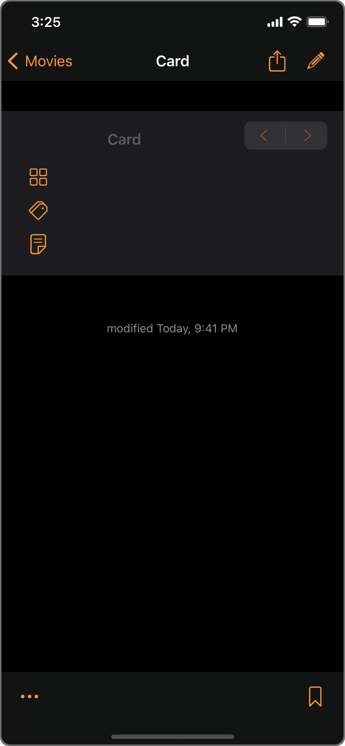
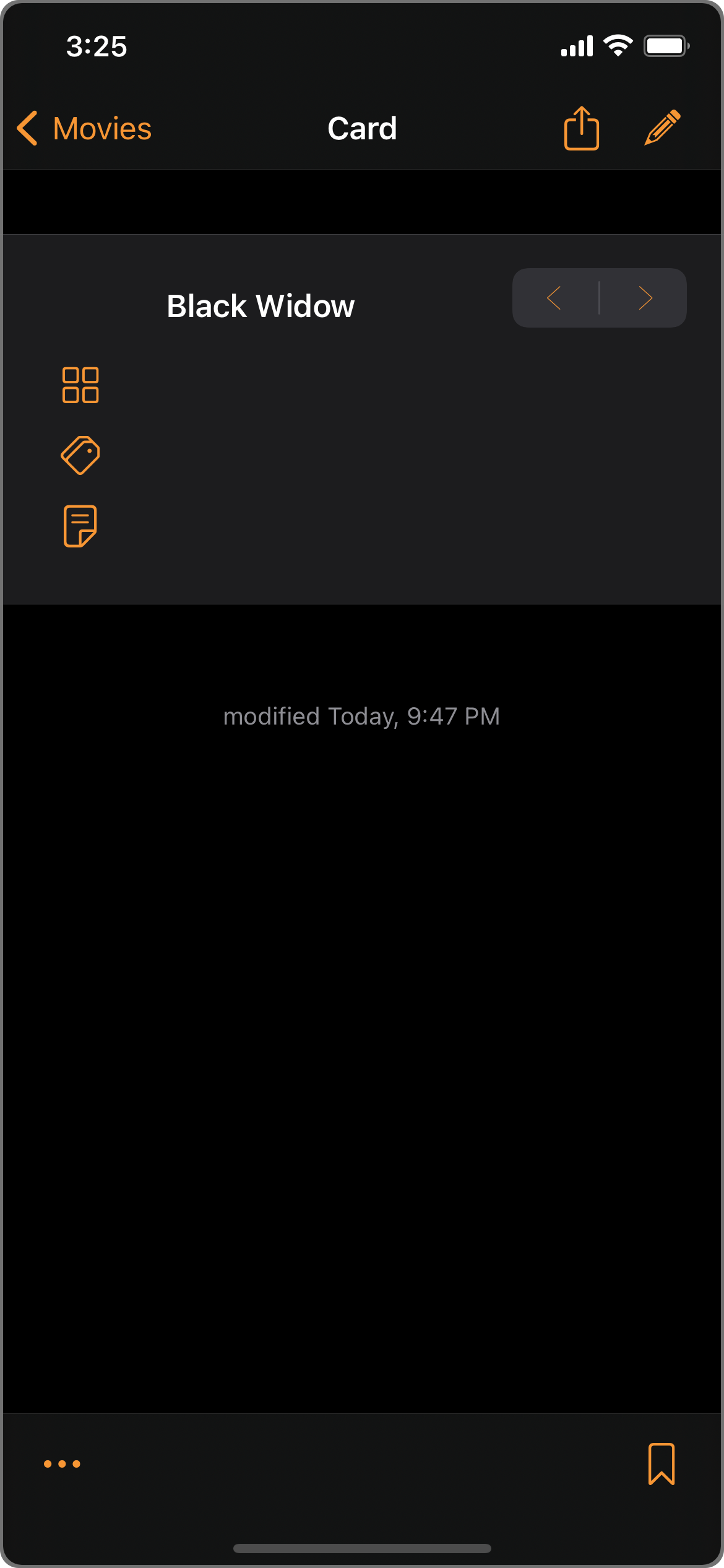
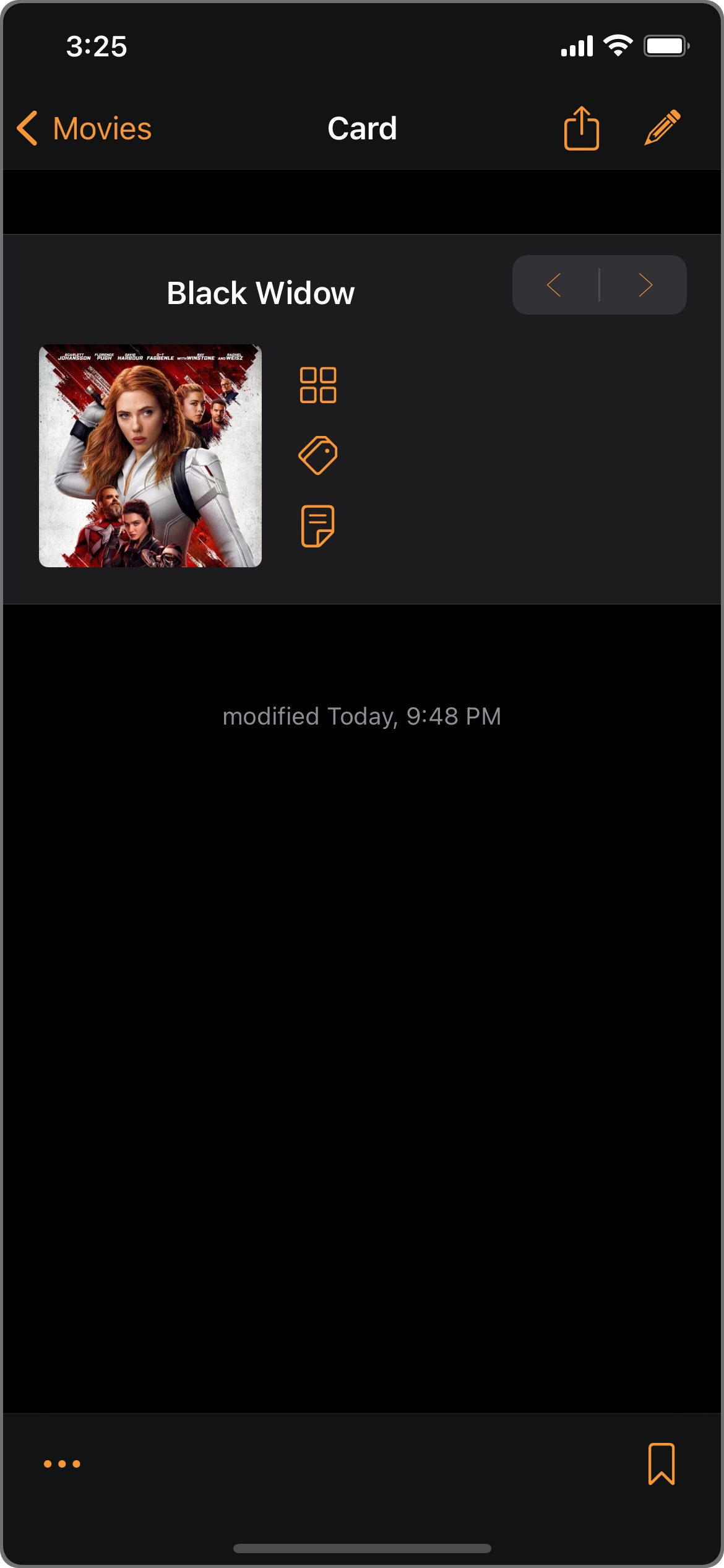
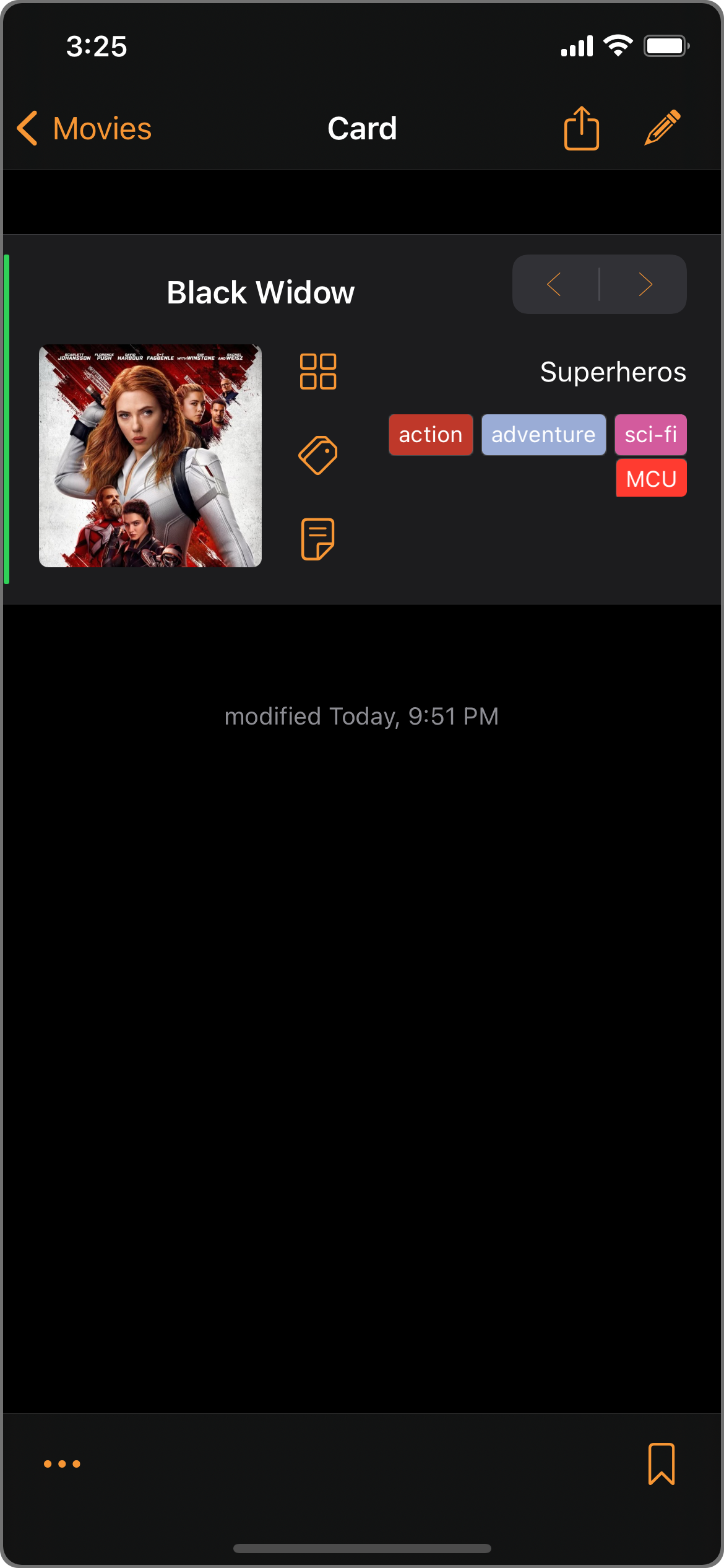
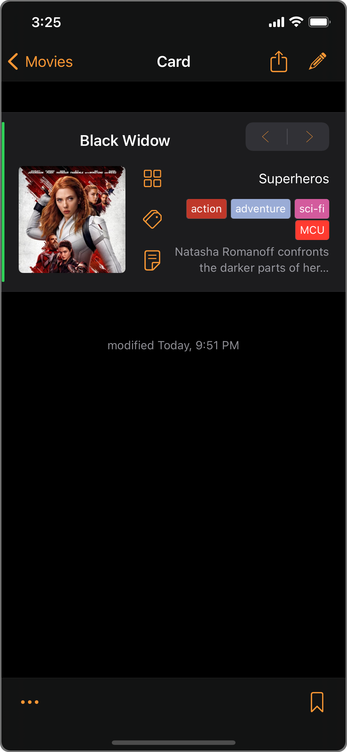
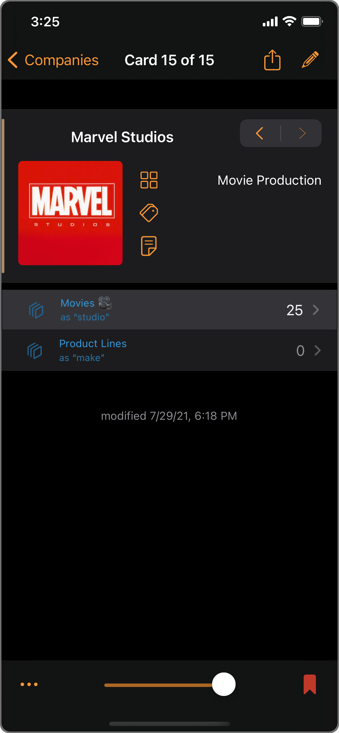
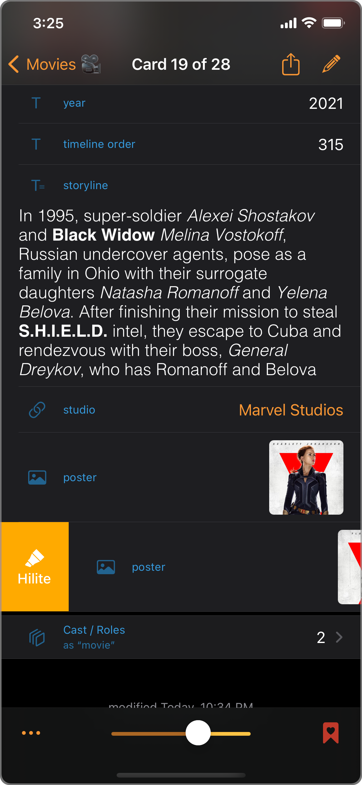
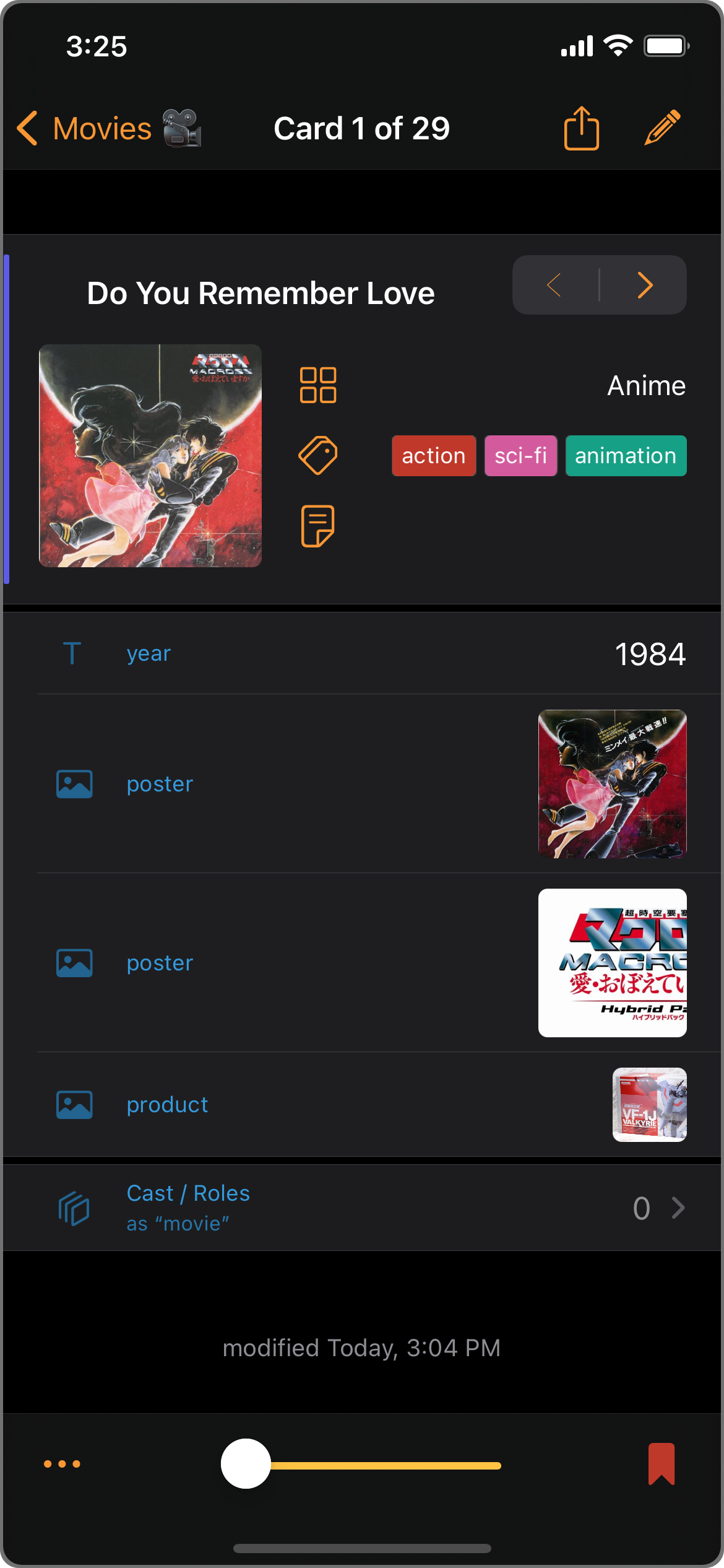
A typical Card window showing data entries.
Browse through Entries (R)
Built-in fields
Even before defining custom Fields, a Card is ready to receive data in the built-in fields:
- Name
- Picture
- including a OCR-powered, editable transcript
- Category
- Tags
- Notes
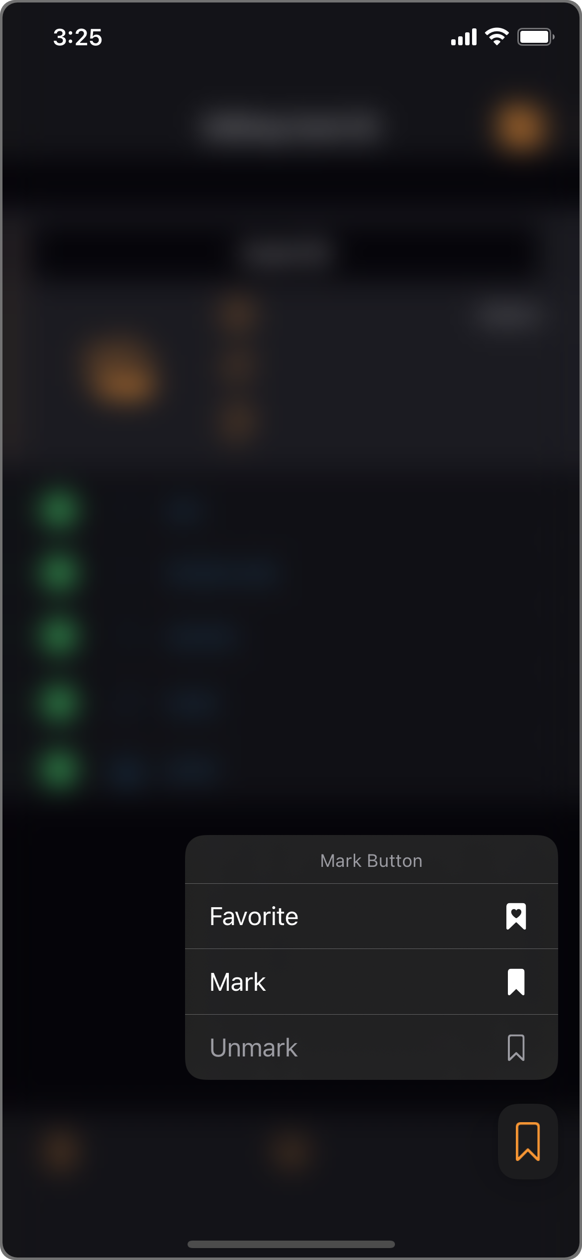
- Mark
- Blank
- Name
- Picture
- Category
- Tags
- Notes
- Mark


There are also automatically maintained fields such as:
- Date/Time Created
- Date/Time Last Modified
- Date/Time Last Accessed
- Access Count
Tap on the date below the data entries to toggle between Created and Last Modified. Tap and hold to see the dates in an alternate format.
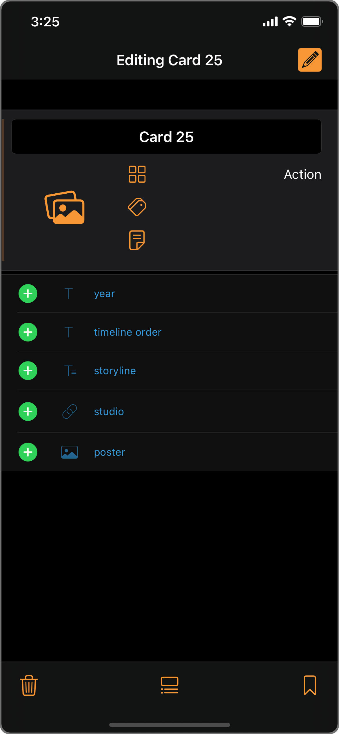
Custom fields
Once custom fields are defined in the Deck, they will be available to the Cards for data entries.
- Custom fields
Text type
If the text field is single-lined (multi-line option not enabled), tapping on the row has no effect in browse mode.
If the field is multi-line enabled, tap on the data entry row to bring up a full-sized text viewer/editor.
If the "One-Tap Fx's" option is on, tapping on a single-line text field activates the Fx.
Link type
Tap anywhere on the data entry row to "follow the link" — opening the linked Card.
If the "One-Tap Fx's" option is on, tapping on a link row outside of the linked Card name activates the Fx. Tap on the tint-colored linked Card name to follow the link.
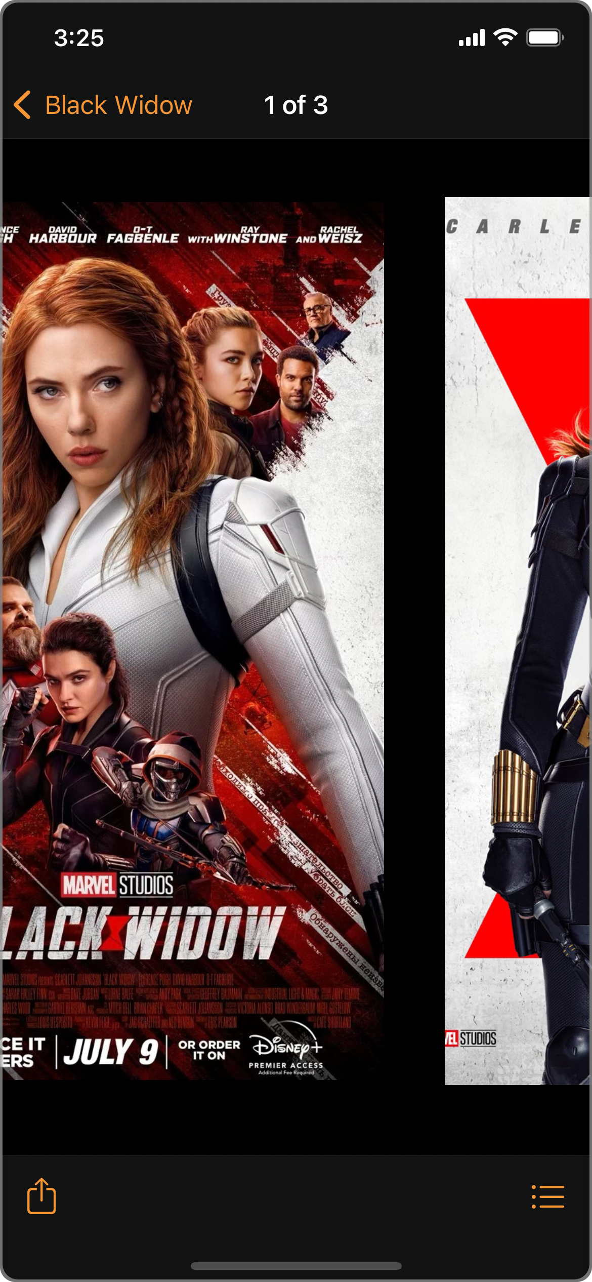
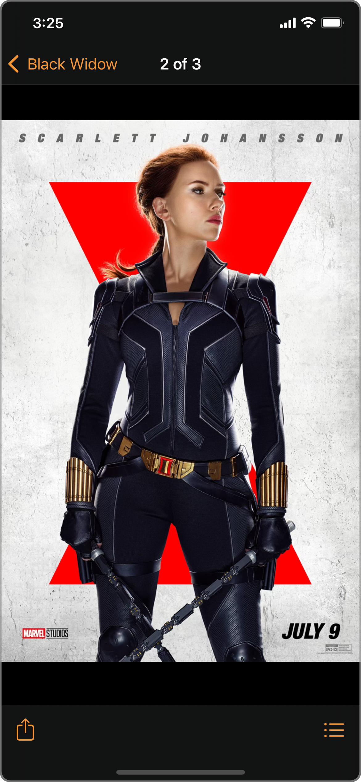
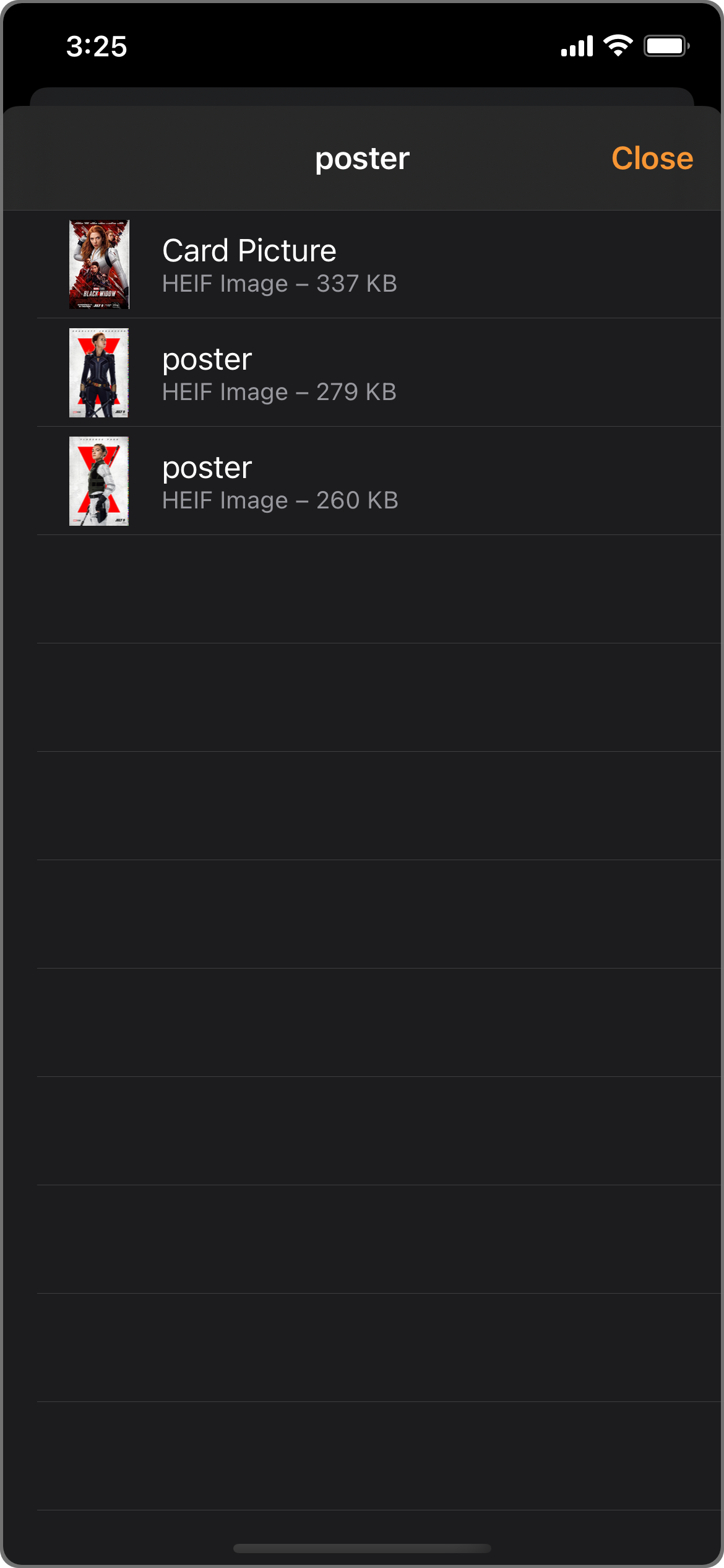
Image types: Pictures & Documents
Tap on the data entry row to bring up a full-sized image viewer.
In the Pictures viewer, you can swipe through all the Card's pictures, including the Card's title picture.
- Swipe through pictures
- 2/3
- 3/3
- Thumbnails

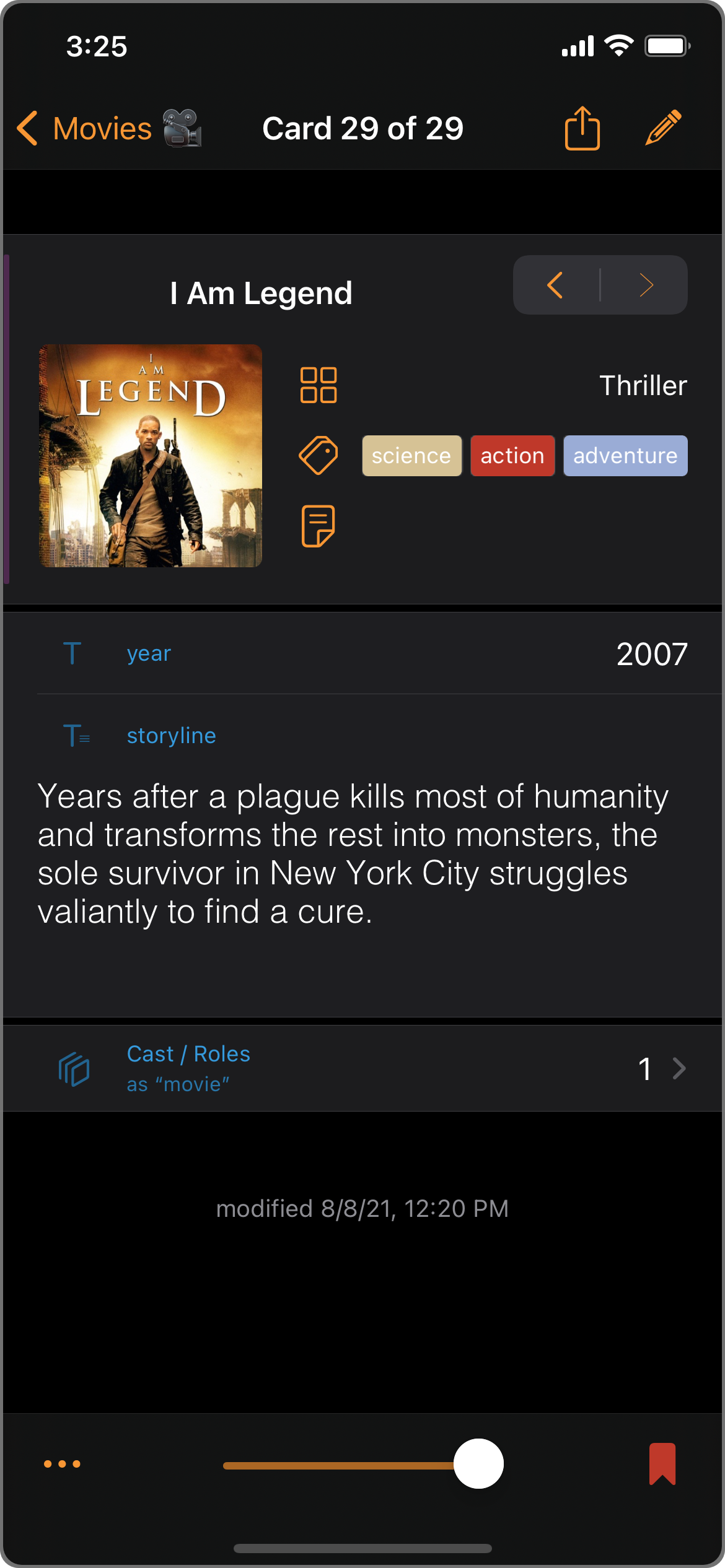
Inbound links
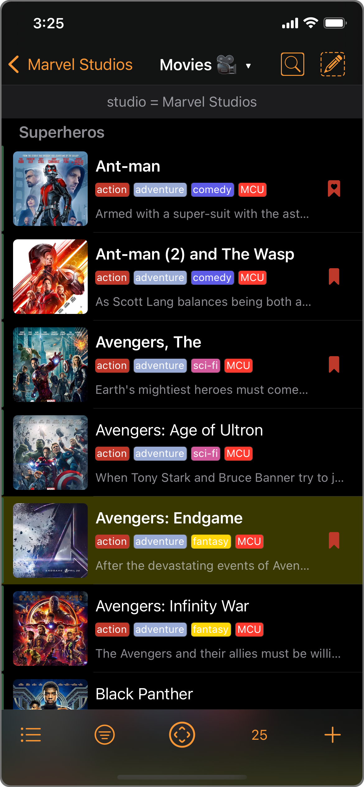
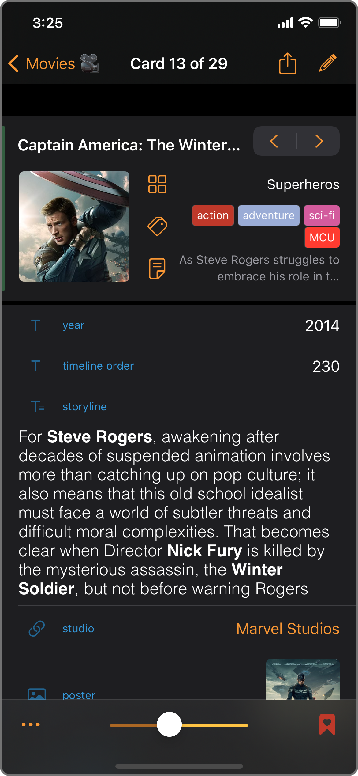
The third section (after built-in fields, and custom fields) is for inbound links.
If any Decks have link fields defined to point to this Card's Deck, the Inbound Links section would have the reverse-links to them, along with a count of the number of Cards linked.
E.g. In the "Studios" deck, the "Marvel Studios" card would have a row like this:
Movies as "studio" 25 >
Tapping on this row would open up the "Movies" deck showing only the 25 Movie cards that have a "studio" link entry to the "Marvel Studio" card.
- Inbound Links
- Linked Cards
Creating or editing Entries (C/U)
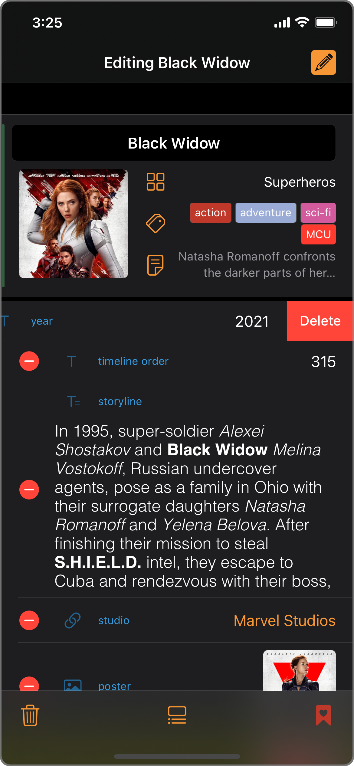
Kase tries to keep you from accidentally changing data. To make sure data change is intentional, you need to enter Edit mode explicitly to add or change data entries.
Edit mode
In Edit mode, custom fields that are defined but not yet filled would show up with a green (+) button for you to add a data entry.
Custom fields that have already been filled would be shown with a red (-) button for you to delete the data entry.
- Editing
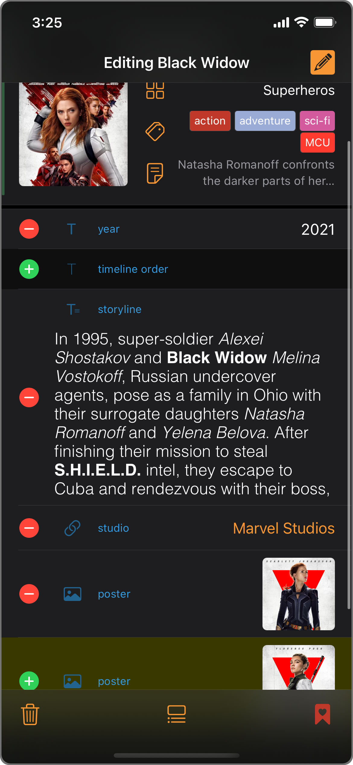
In the case of a Field defined with the "multi-entry allowed" option, a green (+) button would show for the last filled entry even though there are already filled entries.
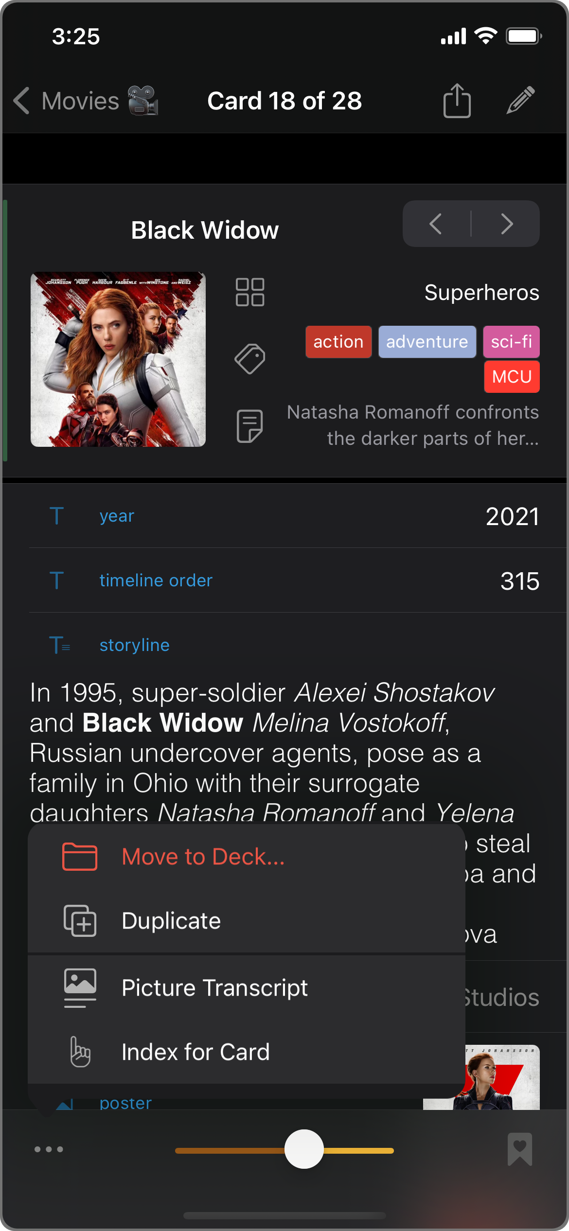
Context menus
More functionalities are surfaced in the context menus.
- Common entries
- Image-type entries
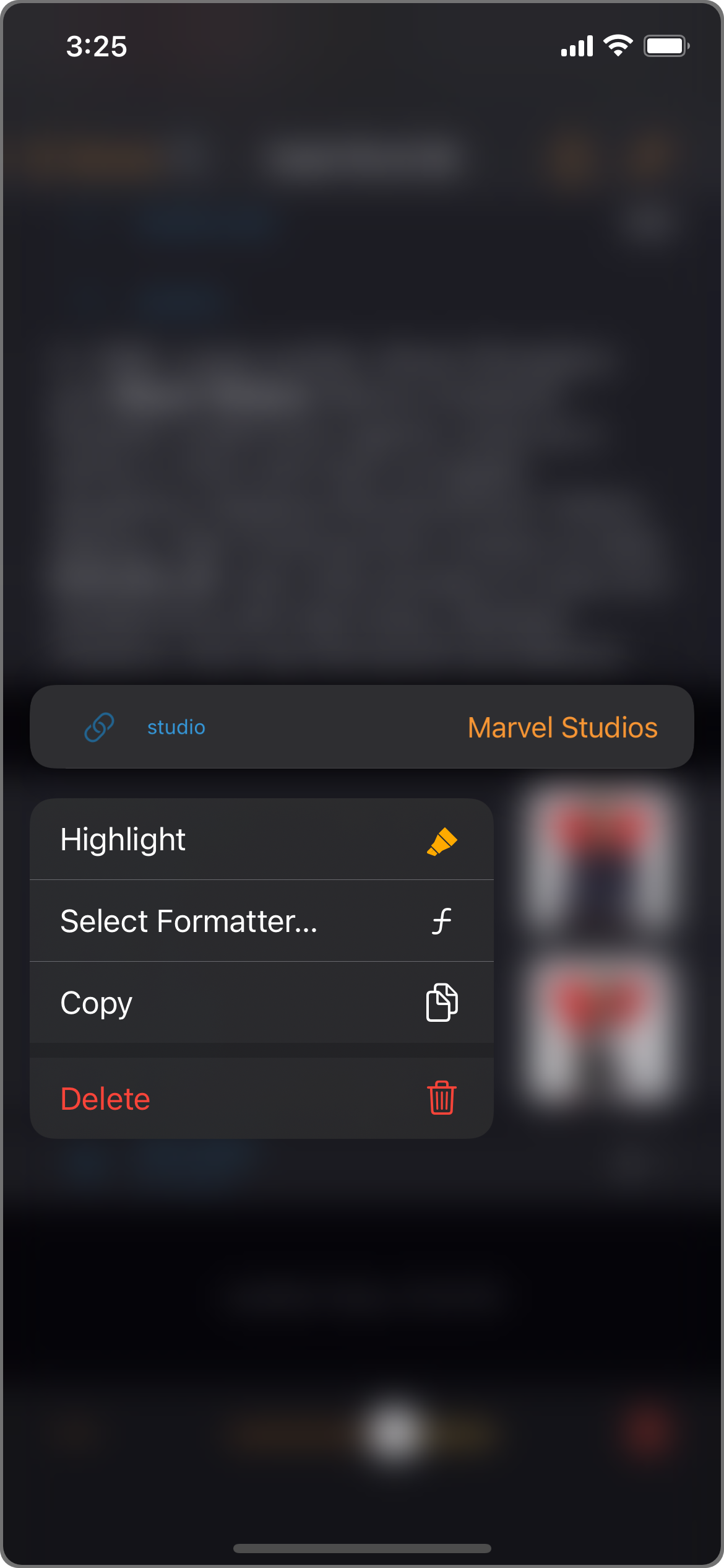
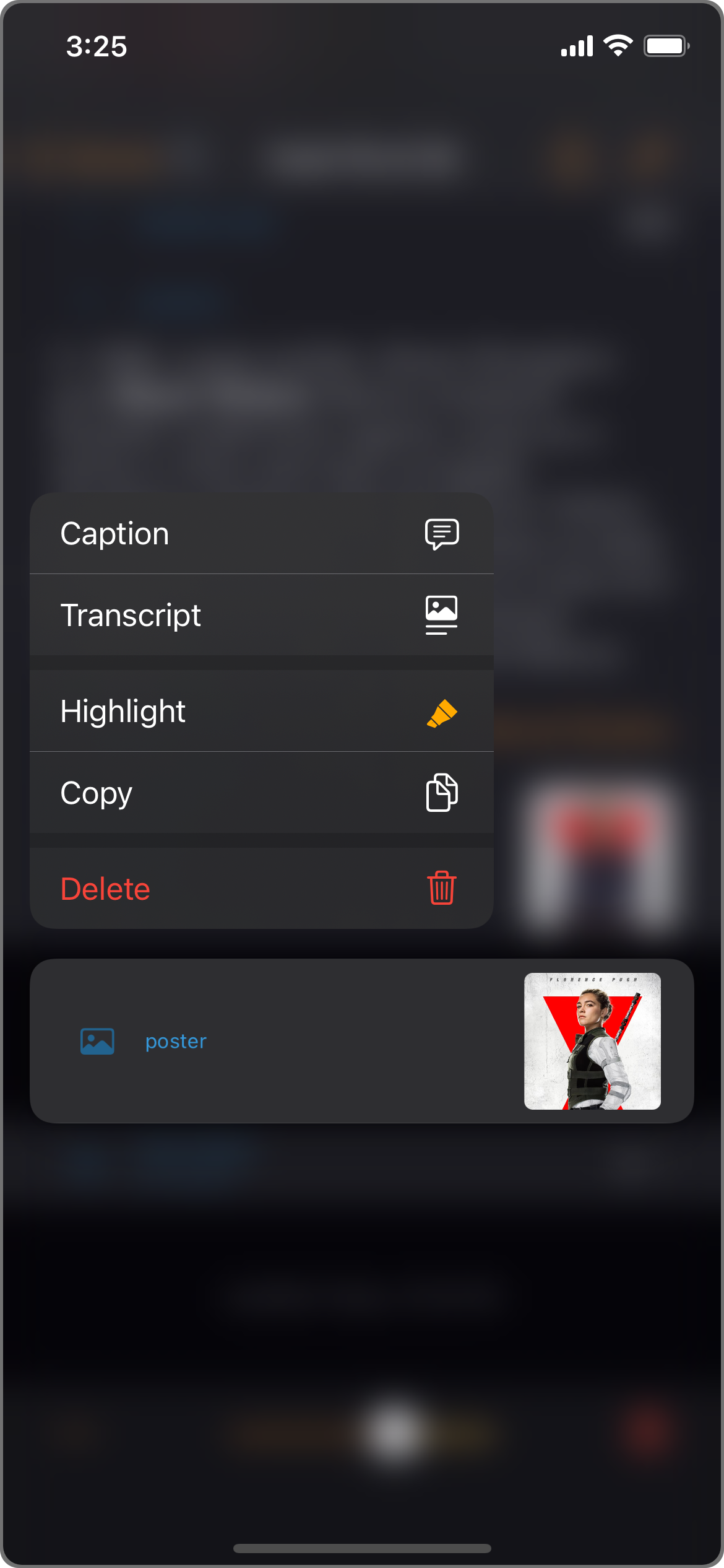
Highlight / Unhighlight
You can highlight any Entry to make it look more distinguished.
Highlighting an entry is not considered an edit; it would not update the Last Modified date.
Formatter (Fx)
...
Some commands are field-type specific. E.g. The Caption and Transcript commands are only available for image type entries.
Swiping shortcuts
- Swipe right
- Swipe left
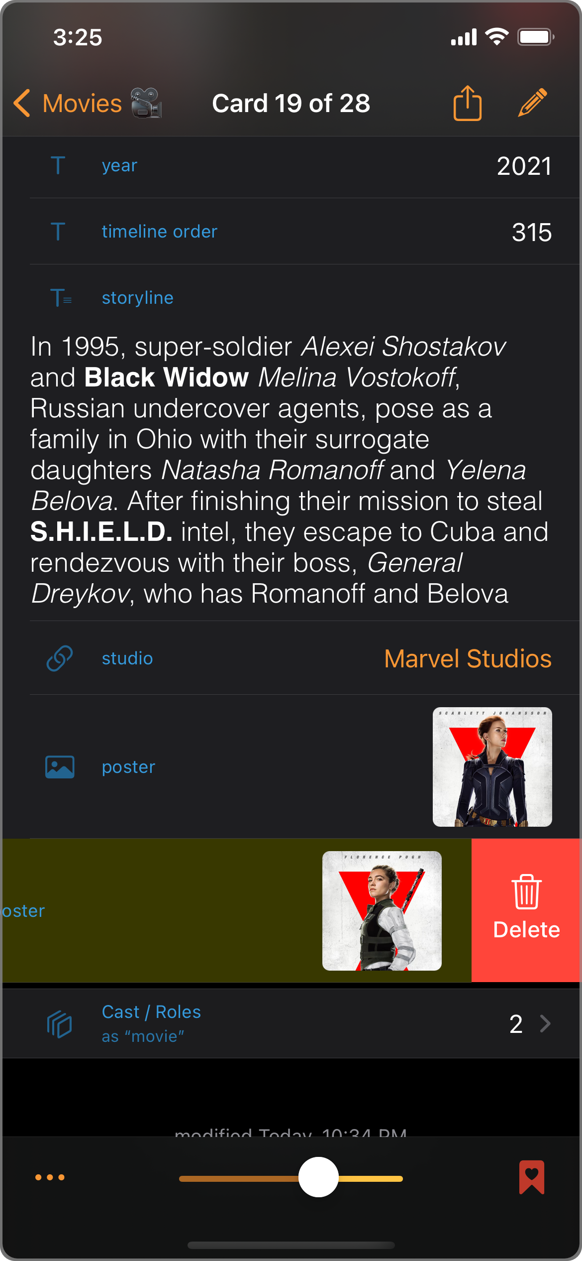
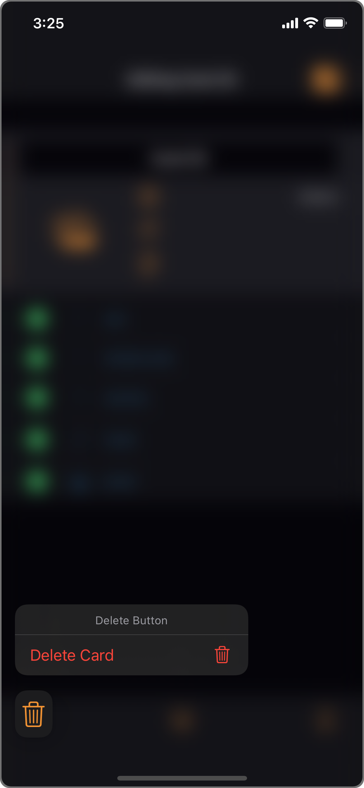
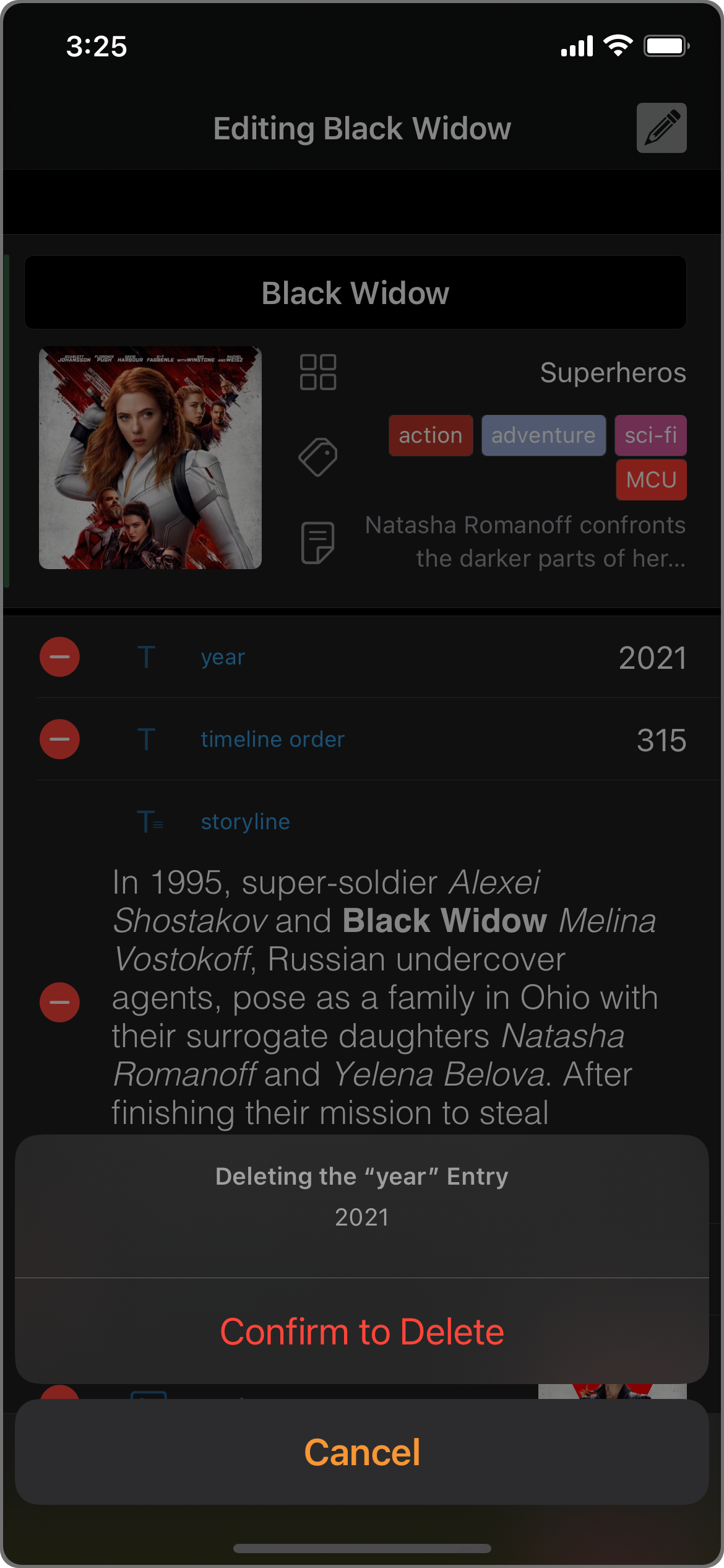
Deleting Entries (D)
- Delete
- Confirm
—————————
Card-level operations
Browse to other Cards
Use the "stepper" arrow buttons next to the Card name to advance to the next Card or browse back to the previous Card. Hold them to increase browsing speed.
Use the "slider" on the bottom toolbar to quickly scrub through the Cards list.
Haptic feedback is provided on both of these controls.
- First
- Middle
- Last
More operations
- Menu
Buttons in edit mode
- Delete
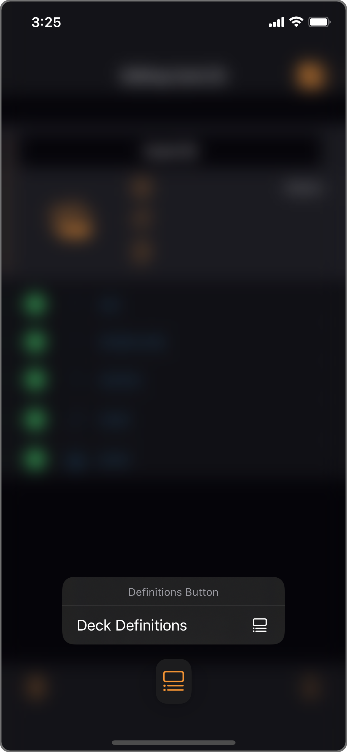
- Deck Definitions
- Mark